
A gird-gap solution, working for Flexbox.
Sometimes I miss some things working with CSS (to be honest I work with SASS, haven’t used Vanilla CSS for a long time) — anyways, Since CSS is constantly being improved and further developed, these days we have wonderful stuff as like Custom Properties, Grid and Flexbox.
What is really cool in grid (in my opinion) is the ability to use the grid-gap property, which allows to set a gap, in between of a containers items, without having a gap to the container it self.
Cool so let’s use this everywhere!
I am so sorry to tell you — there is no flex-gap property yet. Maybe/Hopefully it will come some day (if you know something about it being in development, why it does not exist yet, or maybe why there should not be such a thing, just let me know). If you wanna do that in Flexbox for example (which could be a valid use case), you have to use the “margin-first-child-last-child-approach”.
🙌 Or you writhe that property on your own, by using a SASS mixin – or just use mine instead! 🎉
Sooo, in SASS we’re able to create Mixins, Functions, Loops and many other cool stuff, that we cannot use in CSS yet (I will also never become tired to say how much I love the tidy, clean look of SASS as well! 💘). Enough of the emojis! let’s have a look at some code to realize, what I wrote about before.
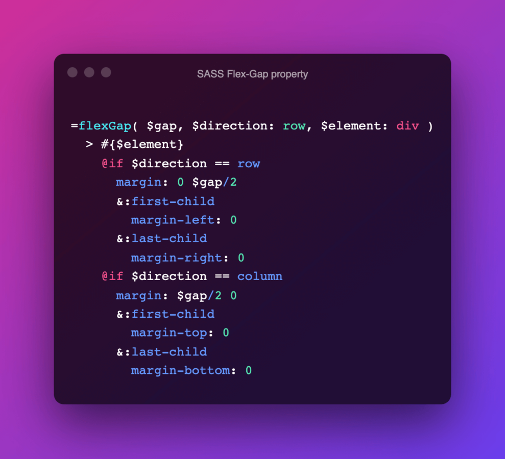
Okay, lets have a look at what I’ve done — what the mixin does is, to select each of the containers children (so you could use the mixin on a Flexbox-Container it self, just like the grid-gap property, not on its children, as you would do it by using margin), adds some margin to them, and removes the first- and last-child margin (left and right).
If you add a direction to the mixin (for example column, if your Flexbox-Containers flex-direction is setted to column, this would make sense), you could remove the children margin-top (first-child) or margin-bottom (last-child) — so the Mixin works with “flex-direction: column” as well.
By default the mixin will effect all divs, which are children of the container. If you flex-container items are of another element-type you could use the Mixins $element statement to set the related element-type or a class or an id as a selector.
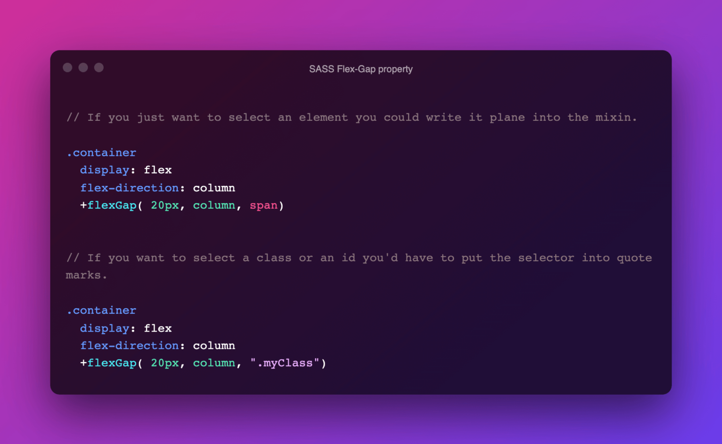
By setting classes or id’s to the flex-container-items you could also just give these different gaps, as well.
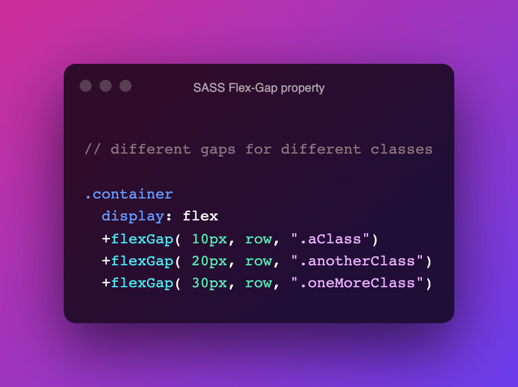
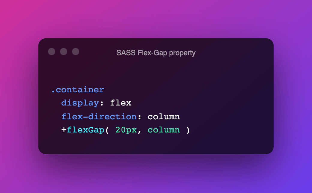
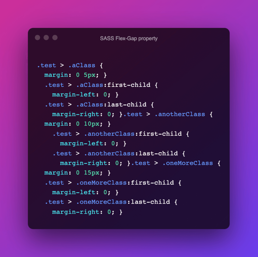
By calling the mixin several times you wont overwrite the first call, instead SASS will generate several instances of the CSS result — so compiled SASS code above would look like the following in CSS:
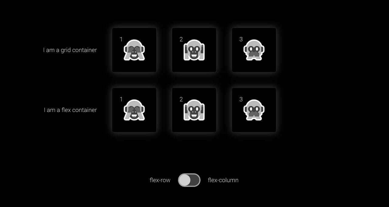
The gap within the flexGap-Mixin can be setted up as a static value (pixel, rem) or a dynamic value (percent, view-port-width), as well — also there is one little, kind of cool side effect! By changing the direction (from flex-row to flex-columns or vice versa) the container-items will have a little transition, if one sets a transition to it — of course this is optional by setting a transition.

See some examples
Here is some demonstration/example of how to use this — just play around, fork, comment, like — do what ever you want with this pen.
The flexGap-Mixin is very small, easy to use and it adds some additional functionality to Flex-Box — if you would add some functionality or change any of its attribute just let me know how and why— if you’d like to use it just go for it – it’s also available on GitHub.