An experimental Flex-Gap property using a custom Sass mixin
Sometimes, working with CSS can be frustrating (to be fair, I mostly work with SASS and haven’t touched vanilla CSS in ages). This article is deprecated – back when I wrote it, the gap property wasn’t supported in Flexbox. Now it is. Still, this post might contain some useful insights, so I’ll leave it online. Why didn’t Flexbox support gap like grid gap) for so long? (Meanwhile, yes, gap does work with Flexbox now.) This article explores an experimental workaround using SASS mixins to replicate gap behavior in Flex layouts — before native support was available.
A grid-gap-like solution for Flexbox
Flex-Gap example on CodePenSometimes, working with CSS can be frustrating (to be fair, I mostly work with SASS and haven’t touched vanilla CSS in ages). That said, CSS has come a long way in recent years — with amazing features like Custom Properties, Grid, and Flexbox.
What I particularly love about CSS Grid is the gap property. It lets you create space between items — without affecting the space around the container itself.
Sounds great, right? Let’s just use that everywhere!
Well… not so fast. At the time of writing this, Flexbox didn’t support the gap property. Hopefully it’ll stick around now that it’s finally supported. (If you know why it took so long — or if it’s still buggy somewhere — feel free to share!) If you wanted gap-like spacing in Flexbox back then, you had to rely on the classic “margin on first/last child” workaround. SASS gives us powerful tools like mixins, functions, loops, and more — all things we still don’t have in plain CSS. (Also: I’ll never stop loving the clean, structured look of SASS. 💘)
Enough talk — let’s look at some code so you can see how this workaround works in practice.
Okay, lets have a look at what I’ve done — what the mixin does is, to select each of the containers children (so you could use the mixin on a Flexbox-Container it self, just like the grid-gap property, not on its children, as you would do it by using margin), adds some margin to them, and removes the first- and last-child margin (left and right).
If you add a direction to the mixin (for example column, if your Flexbox-Containers flex-direction is setted to column, this would make sense), you could remove the children margin-top (first-child) or margin-bottom (last-child) — so the Mixin works with “flex-direction: column” as well.
By default the mixin will effect all divs, which are children of the container. If you flex-container items are of another element-type you could use the Mixins $element statement to set the related element-type or a class or an id as a selector.
By setting classes or id’s to the flex-container-items you could also just give these different gaps, as well.
By calling the mixin several times you wont overwrite the first call, instead SASS will generate several instances of the CSS result — so compiled SASS code above would look like the following in CSS:
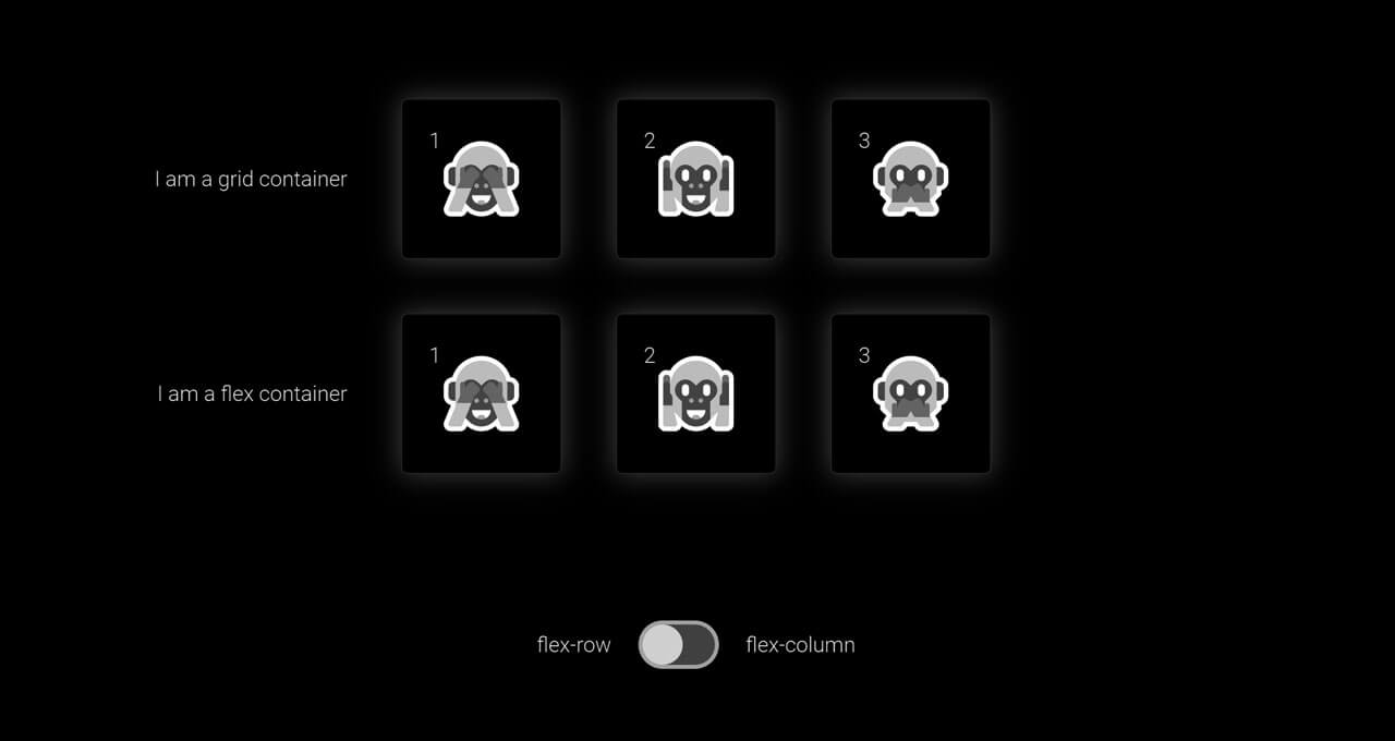
The gap within the flexGap-Mixin can be setted up as a static value (pixel, rem) or a dynamic value (percent, view-port-width), as well — also there is one little, kind of cool side effect! By changing the direction (from flex-row to flex-columns or vice versa) the container-items will have a little transition, if one sets a transition to it — of course this is optional by setting a transition.
See some examples
Here is some demonstration/example of how to use this — just play around, fork, comment, like — do what ever you want with this pen.
The flexGap-Mixin is very small, easy to use and it adds some additional functionality to Flex-Box — if you would add some functionality or change any of its attribute just let me know how and why— if you’d like to use it just go for it – it’s also available on GitHub.
👋 Hello I'm Ali
A Senior Freelance Web Developer based in Cologne/Bonn region, and every now and then I enjoy writing articles like this one to share my thoughts ... : )