
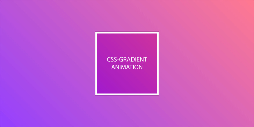
Background gradients cannot be addressed directly via CSS keyframes – nevertheless, there are ways and means to animate them on the web — even without JavaScript.
How CSS Gradients Work
A CSS gradient is a color gradient that is treated by the browser as a background image and can be addressed by CSS as such. In the past, gradients were simply implemented in the form of a background image in the corresponding website. However, CSS gradients allow the developer more control over the visual appearance of the gradient and are also more powerful than a classic image — although they are ultimately treated like background images by the browser (in CSS, for example, CSS gradients are even defined under the background property).
“A gradient is an image that smoothly fades from one color to another. These are commonly used for subtle shading in background images, buttons, and many other things. The gradient notations described in this section allow an author to specify such an image in a terse syntax, so that the UA can generate the image automatically when rendering the page.” (W3C, in: “CSS Image Values and Replaced Content Module Level 3”, https://www.w3.org/TR/css3-images/#gradients)
A CSS gradient can be radial (circular) or linear (from one side to the other). These are several colors, which are drawn by the browser on a drawing area, in different, interlacing gradations. In this article we want to deal more with animation than with basics. A relatively interesting article on CSS-Gradient Basic Knowledge can be found at css-tricks.com.
Animation of linear gradients
Depending on the orientation of a process, different procedures are used to animate it.
With linear gradients, the color transition runs from one side of the element to the other. Accordingly, you can simulate a shift of the gradient by flooding it and then moving it from left to right, for example.
To achieve this, we can proceed as follows. We set the background size to over 100% (e.g. 200%), which means that the course extends over the container element and is therefore only visible in a section of it. In the following, we now drag the gradient in the visible area from one side to the other using the Background Position statement.
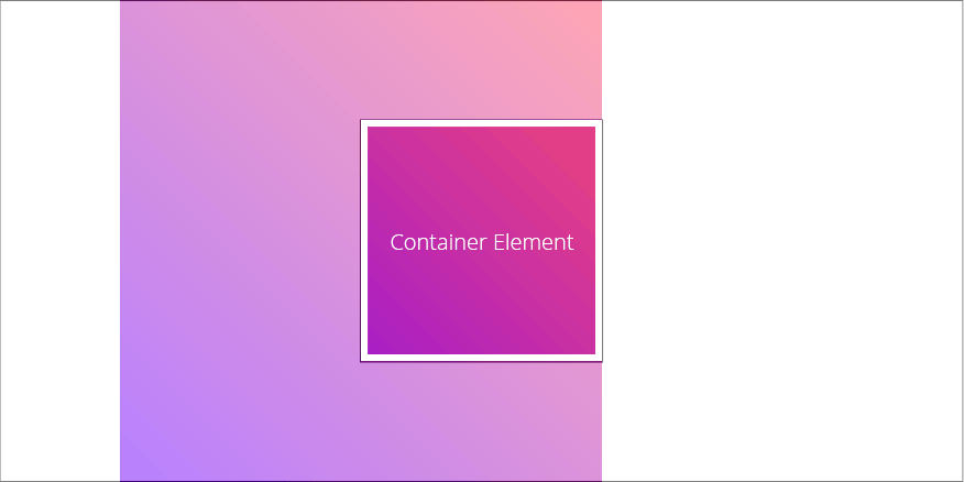
We can achieve this relatively easily and efficiently with CSS keyframes. In the animation instruction we set the background position e.g. from X = 100 to X = 0. Now it looks to the user as if the color gradient really changes, although technically only the background moves from left to right.
When using multiple colors, relatively beautiful color games can be created, which neither the data volume, nor the computing power (of the device) of the user too much strain.
Animation of radial gradients
With a radial gradient, the color gradation runs in a circle from the inside to the outside. As with linear gradients, we can use the overflow principle and simply set the radial gradient to over 100% using background sizing. This now floods the container element again. The user only gets to see a section of the entire course.
Unlike before, the radial course in our example is not animated by background position. Here we use the Background-Size Property to change the CSS gradient accordingly. Now we change it in CSS keyframes and increase it from e.g. 150% to 250%.
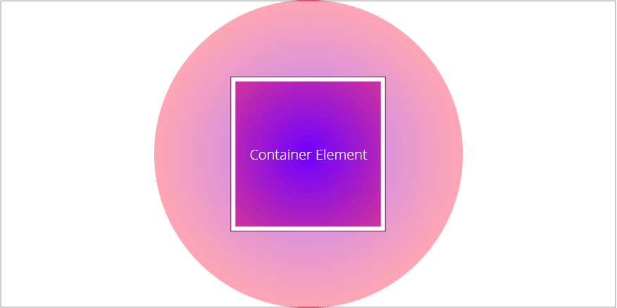
As a result, the user sees a changing course, which moves from the inside to the outside. In fact, you can also work with the position here to achieve a different animation effect, and you can also apply the animation to the linear gradient by changing the background size, for example to simulate a synchronous gradient change from the inside out to the edges.
If you’re interested in more information about animating background-gradients with CSS make sure to read part 2 of this article, where I provide an experimental approach to animate background gradients.